





Dental website design: 5 reasons your dental practice website isn't converting visitors into consultations
Most dental websites look fine at first glance. On the surface, the dental website design feels clean, with nice images and a few treatment pages. On paper, everything is there - but behind the scenes, they are not doing the one job that matters most: turning visitors into booked consultations.
This is where many practice owners get stuck. You invest in SEO, ads or social, traffic starts to grow, but the phone doesn't ring any more than before. It is frustrating, and often confusing. Is the problem visibility, or is something else?

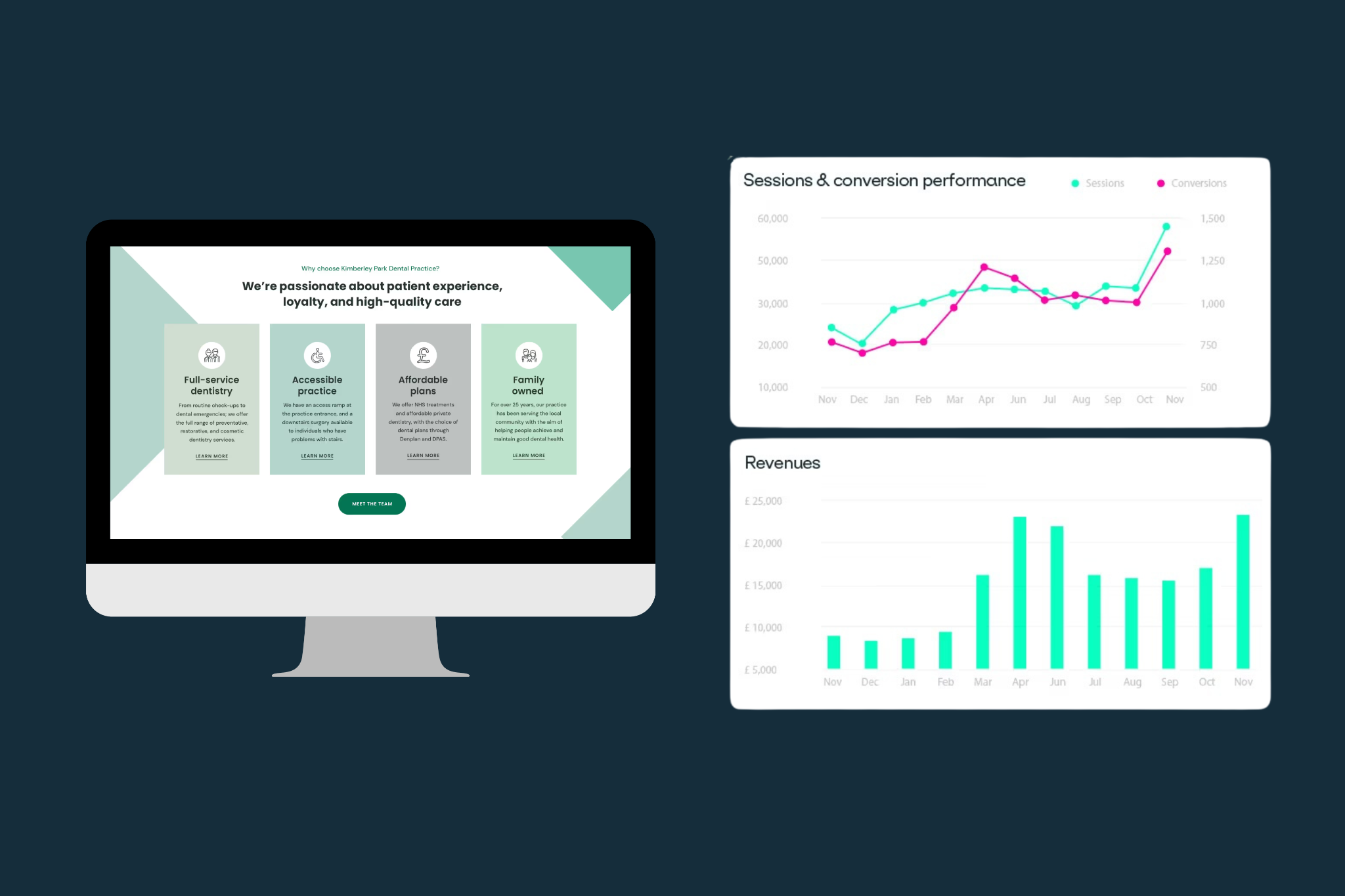
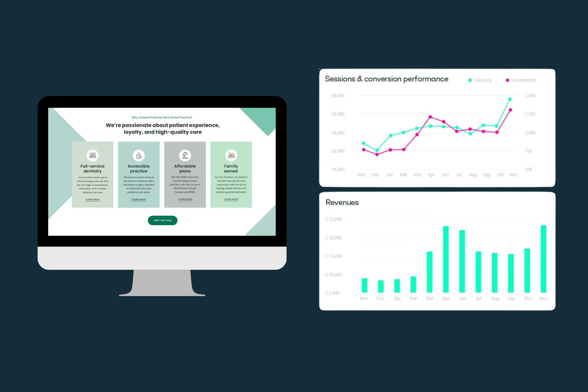
We often see practices getting hundreds, sometimes thousands, of website visitors each month, but only a handful of enquiries. That gap is where growth is being lost.
In many cases, it is not a problem with website traffic - it's an issue with conversion.
The good news is that once you know what to look for, it becomes much easier to fix. In this guide, we walk through the five most common reasons dental website design fails to convert, and what you can do to improve it.
Key takeaways
- If you are getting traffic but not bookings, your website is likely the issue, not your marketing
- Most dental websites lose patients through slow speed, unclear navigation and weak calls to action
- Treatment pages should answer patient questions, not just describe services
- Small improvements to user experience and booking flow often deliver the biggest gains
How to tell if you've got a traffic problem or a conversion problem
Before making any changes, it is worth getting clear on where the issue actually sits. A simple starting point is this: How many visitors are reaching your booking page or enquiry form?
If your site is getting very little traffic overall, then yes, visibility is part of the problem. But if you have steady traffic and very few people progressing to book, your website is likely the bottleneck.
You might recognise some of these signs:
- Your front desk team says patients mention struggling to find how to book
- Visitors land on treatment pages but leave without taking the next step
- You are investing in ads, but cost per enquiry feels high
- Competitors with similar services seem to be getting more enquiries
This is where many practices make an expensive mistake. They double down on ads or SEO to drive more traffic, without fixing the experience on the site itself.
If the website is not set up to convert, more traffic simply means more missed opportunities.
The 5 reasons dental websites fail (and how to fix each one)
1. Slow load times, especially on mobile
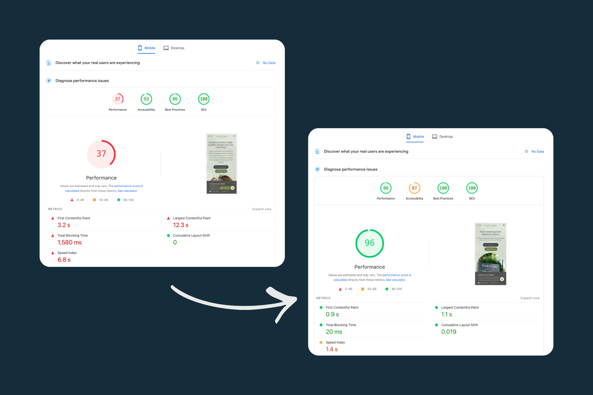
Patients are impatient. If your site takes more than a few seconds to load, many will leave before they even see your content.
This is even more important on mobile, where the majority of dental searches now happen. A slow, clunky mobile experience is one of the biggest silent killers of conversion.
Common causes include oversized images, outdated platforms, and poor hosting.
The fix is usually technical but straightforward:
- Optimise image sizes without losing quality
- Use modern frameworks that prioritise speed
- Review your hosting setup and page structure
- Make sure buttons, images and content stay stable while the page loads - this is referred to as CLS (Cumulative Layout Shift). High CLS scores frustrate users and can hurt Google rankings.
Fast-loading pages are not just better for users. They also support your wider dental website SEO performance.
2. No clear path to booking
A surprising number of dental practice website design projects focus heavily on aesthetics, but forget about navigation.
If a patient has to think about where to click next, you have already lost momentum.
Too many menu options, unclear calls to action, and inconsistent button placement all create friction.
A well-structured site makes the next step obvious at every stage. Whether someone lands on your homepage or a treatment page, they should always know how to book.
This means:
- Clear, visible booking buttons throughout the site
- Consistent wording such as “Book consultation” or “Book appointment”
- Simple navigation that guides rather than overwhelms
If patients are telling your reception team they could not find the booking page, the site is working against you.
3. Treatment pages that read like brochures, not patient guides
Many treatment pages are written from the practice’s point of view, not the patient’s.
They list features, qualifications and equipment, but do not answer the questions patients actually have.
Think about what someone searching for “Invisalign Croydon” or “dental implants near me” is really looking for. They want to know:
- Will this work for me
- What does it involve
- How long does it take
- What does it cost
- Will it hurt
If your pages do not address these concerns clearly, visitors will leave to find answers elsewhere.
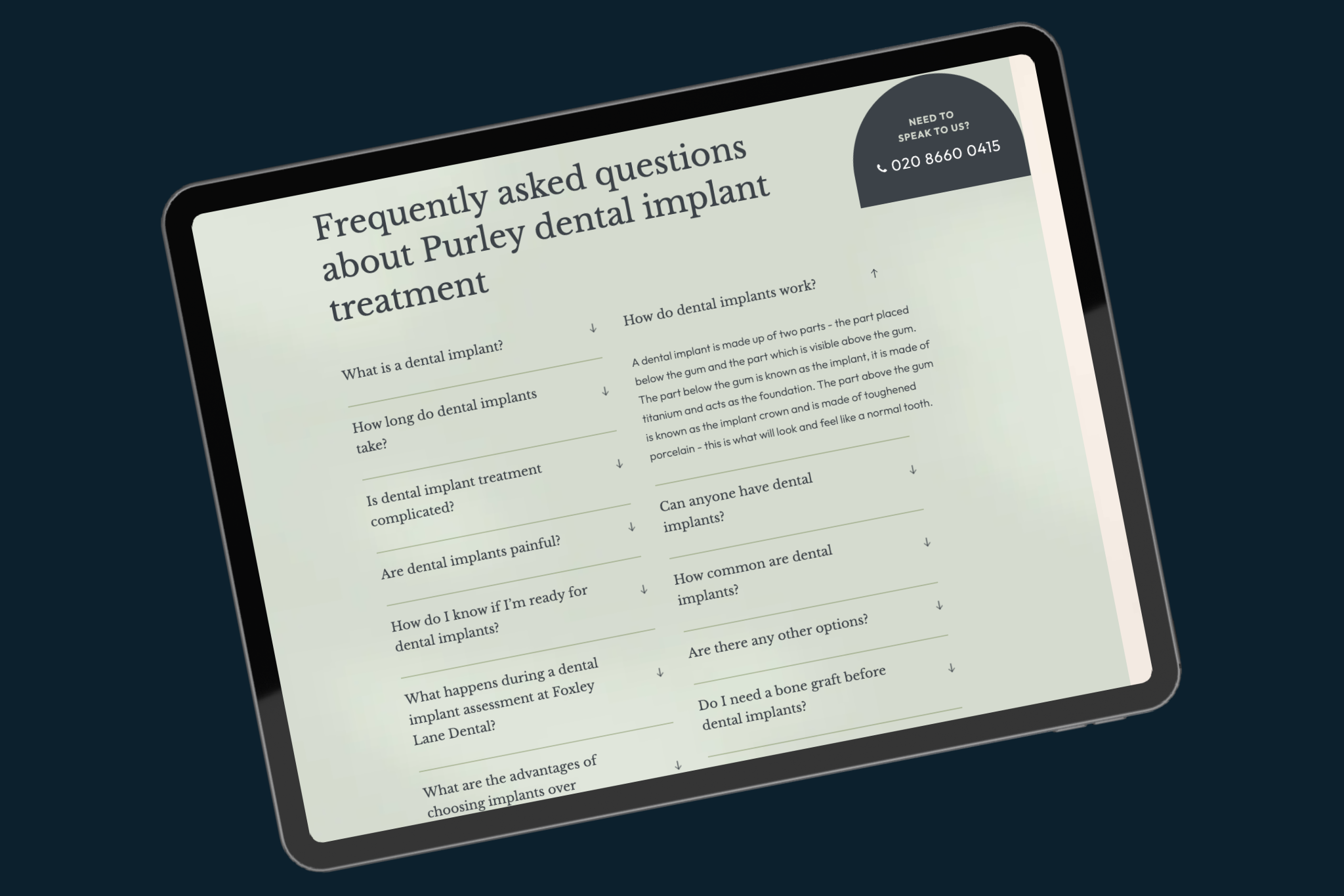
Strong dental website design in 2026 treats every treatment page as a guide, not a brochure. Content should feel reassuring, clear and genuinely helpful.
This is also where structured content supports both users and search engines. It helps you show up for real patient queries and improves your chances of being featured in AI-generated search results.
4. Missing trust signals
Choosing a dental practice is a big decision. Patients are looking for reassurance before they commit. If your site does not build trust quickly, they will hesitate.
These trust signals help patients feel confident they are making the right choice. Without them, even a well-designed site can feel generic or impersonal.
A strong dental web design UK approach blends visual appeal with credibility. It shows who you are, how you work, and why patients should trust your practice.
Common missing elements include:
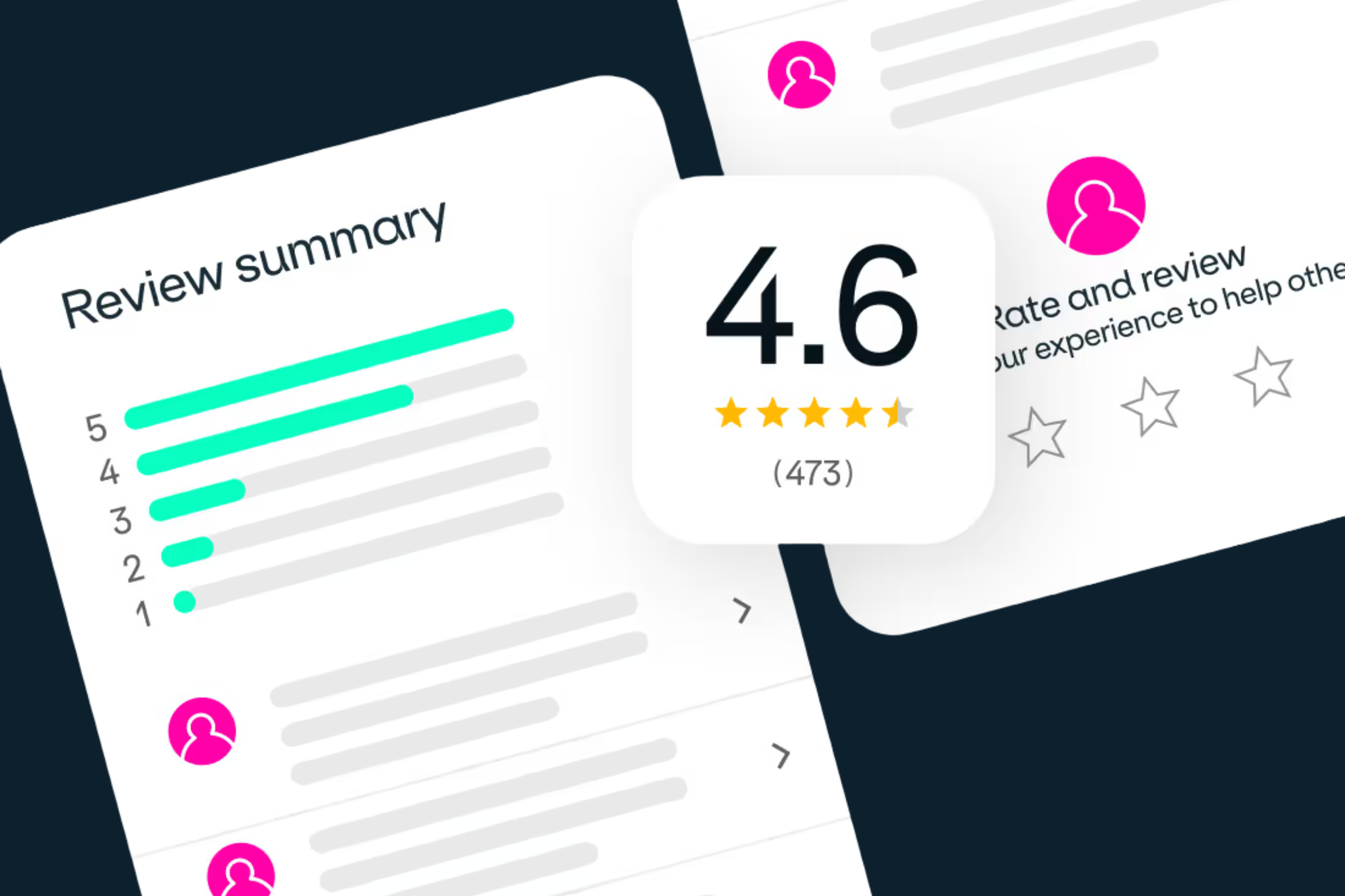
- Genuine patient reviews
- Before and after images where appropriate
- Clear clinician credentials and GDC numbers
- Awards or accreditations
- Finance options explained simply
- Team photography and personality throughout the website
But what do we mean by personality?
Patients increasingly choose practices based not only on treatment information, but on the people, atmosphere and overall feel of the brand. If a website feels cold, generic or overly corporate, it becomes harder for patients to picture themselves there.
Pages such as “Meet the team” are often some of the most visited pages on a dental website. That’s because patients want to know who’ll be treating them before they ever step foot through the practice door.
You can often see this reflected in patient reviews too. Take Feel Good Dental for example. Spend a few minutes reading their Google reviews and you’ll quickly notice patients talking not only about the treatment itself, but about how the team made them feel. That human connection matters.
Simply put, people buy from people - so your website should reflect the personality, values and experience behind the practice, not simply list treatments.
5. A booking experience that fights the patient
Even if everything else works well, a poor booking process can undo it all.
Long forms, confusing steps, or limited availability can stop patients at the final hurdle.
Think about the experience from their point of view. They have decided they are interested. They are ready to take action. Then they hit friction.
Small user experience (UX) improvements often make a significant difference to conversion rates.
This includes:
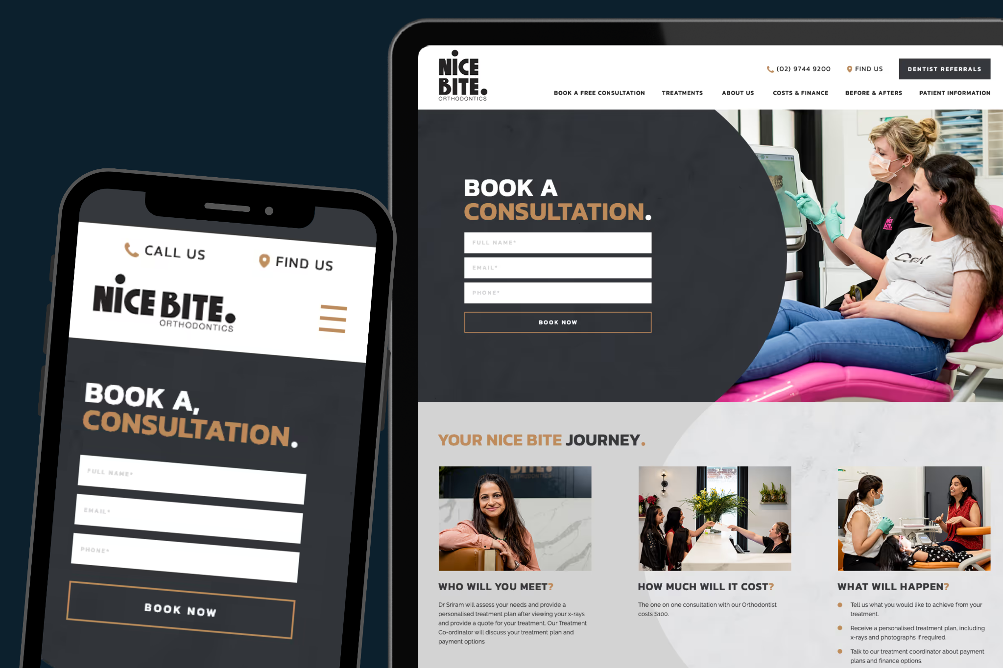
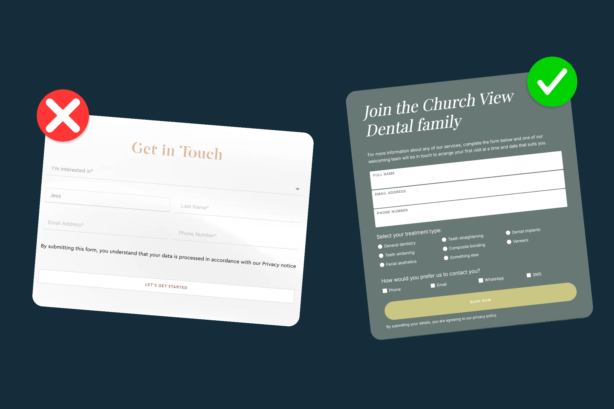
- Short, easy-to-complete forms
- Clear, high-contrast booking buttons
- Simple form layouts that feel easy to use on mobile
- Radio buttons or quick selections instead of long dropdown menus
- Floating form labels and cleaner input design
- Clear options for booking, calling or sending an enquiry
- Visible availability where possible
- Mobile-friendly booking systems
Form UI and UX design have a major impact on conversions. Across hundreds of dental websites, we’ve consistently seen better enquiry rates when booking journeys feel faster, clearer and easier to complete.
A great dental website should make taking the next step feel effortless, not frustrating.
This is also where integration with tools such as CRM systems and front desk automation becomes valuable, helping create a smoother experience for both patients and practice teams.
You can explore how this works in more detail through front desk automation.
What "good" looks like in 2026 dental website design
The standard for dental website design has shifted significantly over the past few years.
Patients expect a seamless, intuitive experience that feels as polished as any other service they use online.
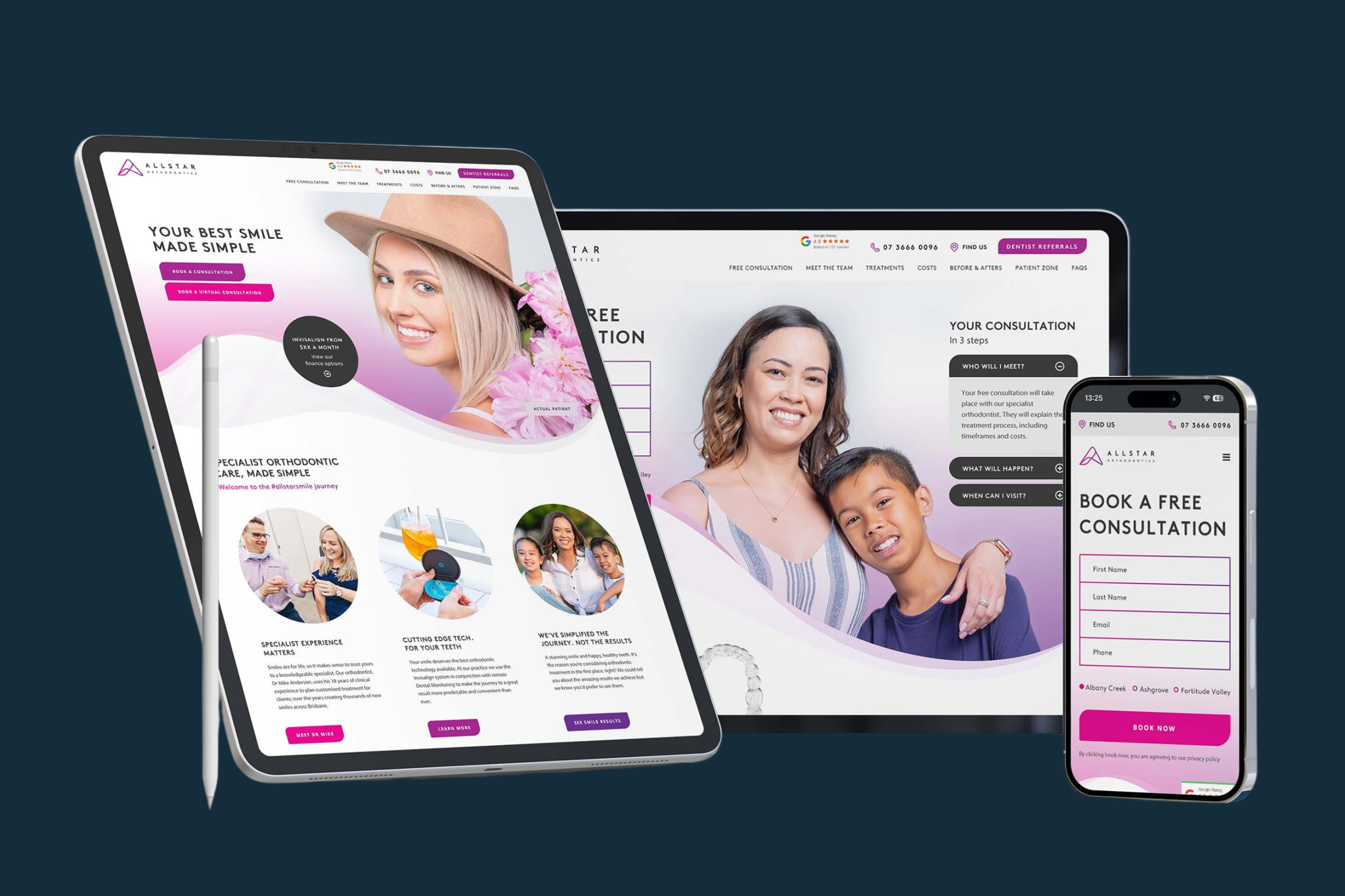
A high-performing dental practice website design in 2026 typically includes:
- Mobile-first layouts that feel natural to scroll and interact with
- Fast loading speeds across all devices
- Clear, accessible navigation that guides users effortlessly
- Treatment pages built around real patient questions
- Conversion elements placed prominently but not intrusively
- Smart use of video to explain treatments and build connection
- Transparent finance options to reduce hesitation - online calculators work especially well for giving patients a sense of control
- Optional tools such as live chat for quick questions
If your site feels dated, difficult to use on mobile, or unclear in its messaging, it is likely falling behind current expectations.
When to redesign vs when to optimise
Not every website needs a full rebuild.
In some cases, a targeted approach to dental website conversion optimisation is enough to improve results.
Here are some simple signals.
You may need a dental website redesign if:
- Your site is more than three years old
- It struggles on mobile devices
- Branding no longer reflects your positioning
- The platform is slow or difficult to update
If that sounds familiar, a full rethink and website redesign approach may be the right step.
On the other hand, optimisation is often the better route if:
- Your site looks modern and functions well
- Traffic levels are reasonable
- Conversion rates are low
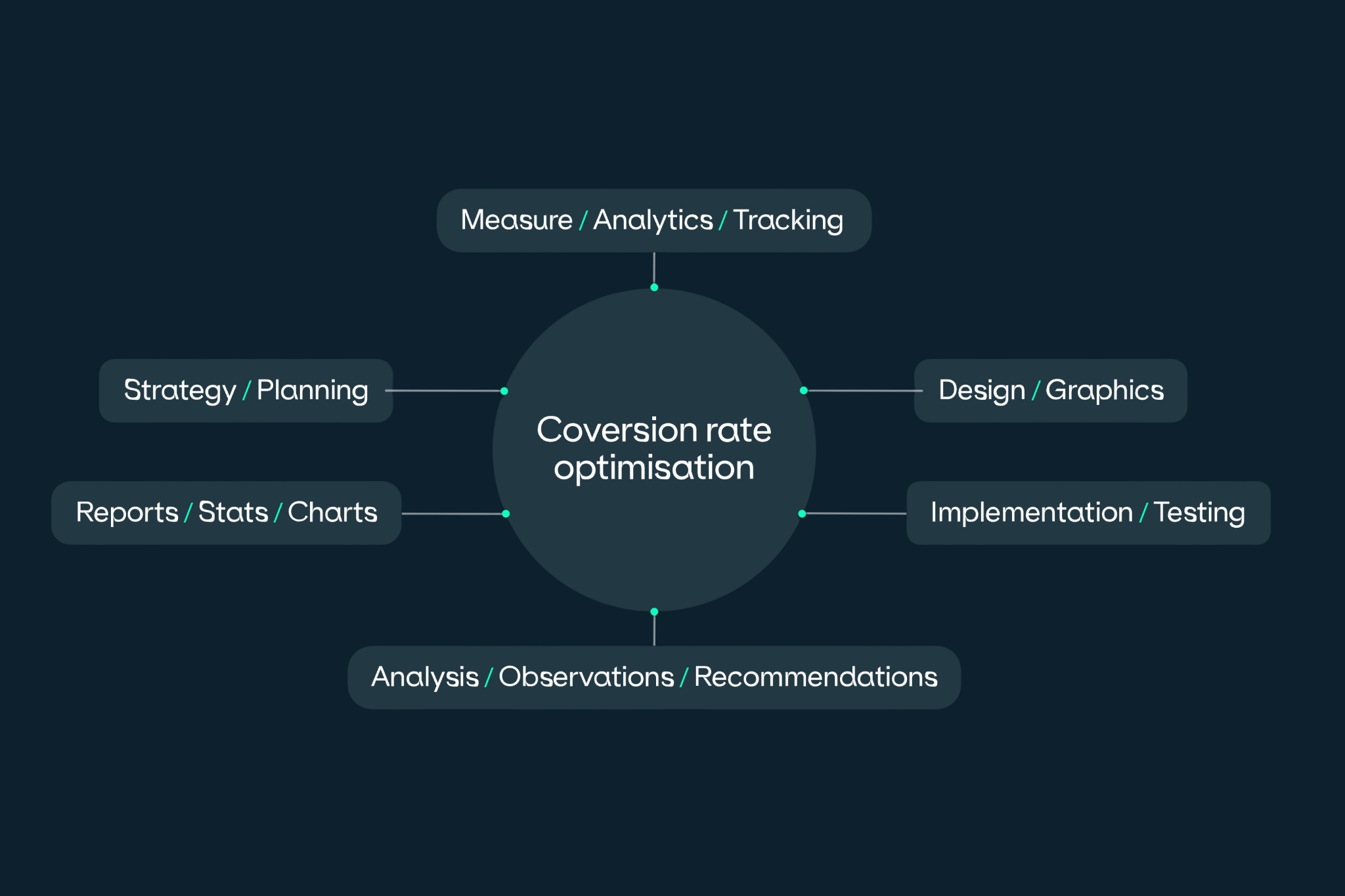
In this case, focusing on conversion rate optimisation can unlock more value from the traffic you already have.
You can also explore how CRO supports growth here.
How Transcend Dental approaches dental website design and conversion
At Transcend, we look at dental website design as part of a wider growth system.
It’s not just about how the site looks, it’s about how it performs.
Our approach combines strategy, design and ongoing optimisation.
For new builds, we create fast, scalable websites using platforms such as Webflow and WordPress, alongside custom development solutions and modern hosting platforms such as Vercel.
Many practices choose dental Webflow website design for its speed, flexibility and ease of editing, while WordPress remains a popular option for larger or more bespoke website requirements.
For existing websites, we focus on identifying where enquiries and conversions are being lost, then improving those areas over time.
This might include:
- Refining page structure and calls to action
- Improving treatment page content
- Simplifying booking journeys
- Enhancing trust signals
- Improving website speed and mobile usability
We also use tools such as Cloudflare to support website speed, CDN delivery, SSL security and overall site reliability behind the scenes.
The goal is always the same: Turn more of your existing website traffic into real patient enquiries.
Let's get your website working harder for you
Not sure whether your website needs a redesign or a few smart tweaks?
Download our free website optimisation checklist or book an audit with our team for a clear, practical review of your current site